Okay, let’s talk branding. Yup, that big word we all hear but never really know what to do with—until, bam, we realize it’s time. You’re ready to show the world who you are as a makeup artist, and honestly? Your logo and brand should shout YOU from the rooftops.
But don’t stress. If you’re like me and you’ve lost your eyeliner at least 20 times (because, priorities), then let’s break this down in a way that even we can nail.
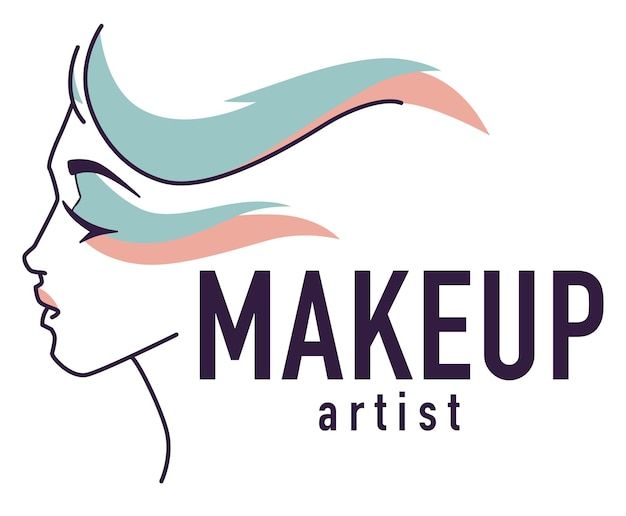
Step 1: Start With What You Love
First thing’s first, your brand has to feel right. When you picture yourself as a makeup artist, what vibes are you putting out there? Are you all about edgy glam, classic beauty, or maybe that effortless, natural glow? Once you figure that out, your logo and brand should feel like an extension of that style.
If you’re the bold, dramatic type, your logo should have some sass! Think dark, sleek colors, maybe sharp lines, or even a funky font that feels a bit daring.
If you’re more on the soft and natural side, go for pastel tones or earthy hues. The font should be delicate and elegant, like a gentle sweep of mascara.
Take a second and scroll through your Instagram feed. What’s your vibe there? That’s a good place to start. Your brand should flow seamlessly from your online presence.
Step 2: Choose Your Colors Like You Choose Your Lipstick
Color is everything! It’s like when you pick out that perfect shade of lipstick—you want it to make a statement without being too in-your-face. A good brand color palette should vibe with your style and personality, but also keep things cohesive. No neon greens if you’re all about those natural browns, ya know?
Stick with 2-3 main colors (and maybe an accent color for fun). You don’t want to overwhelm people with too many choices—unless you’re doing neon body art. But we’re not here for that… right?
You don’t need a graphic designer to choose your colors. There are some fab tools out there like Coolors or Adobe Color Wheel. They can help you create a palette that works together. It’s like the makeup version of color theory—easy peasy.
Step 3: Fonts Matter More Than You Think
Now, let’s talk fonts. I know, it sounds boring, but trust me, they matter. A funky script font might look cute on a coffee cup, but it can be hard to read on a business card or your website. Stick to one or two fonts that are clean, readable, and match your overall vibe. It’s like your signature makeup brush—the one you can’t live without.
Use bold, sans-serif fonts for modern, clean looks. Or if you’re going for something more traditional or luxurious, serif fonts might be your jam.
Step 4: Keep It Simple
We’ve all been there: starting with a logo that’s too busy and then realizing it looks more like a glitter explosion than professional branding. Keep your logo clean. A simple design is not only easier to recognize, but it’s also easier to scale—because you’ll want it everywhere. Think business cards, social media, even your makeup kit.
Less is more. If you’re not sure, take away one element and see if it still works. If yes, then it’s perfect. If no, add a little something back.
Step 5: Make It Personal (But Not Too Personal)
This is where it gets fun: your brand should tell your story. Maybe you have a signature makeup technique that people always ask about—let that be part of your brand! It could even be a little symbol like a brush, lipstick, or even your initials. But don’t overdo it. You’re not making a scrapbook, so pick one or two elements that really represent what you do best.
Get inspired by your favorite makeup trends and think of ways to incorporate those into your logo. If you’re all about bold eyes, a cute little eye icon can do wonders.
Step 6: Test It Out
Okay, now you’ve got your logo, colors, and fonts all set up, but before you go slapping it everywhere, test it. Does it look as good on a website as it does on a tiny business card? How about on social media? Make sure it’s versatile and easy to recognize in different sizes and formats.
Ask a few people (who aren’t your mom) for feedback. Their opinion will give you a fresh perspective.
Get Inspired, Don’t Copy
It’s tempting to look at other makeup artists’ logos and think, “That’s it! That’s exactly what I need!” But no—your brand should be as unique as your technique. Inspiration is great, but don’t fall into the trap of copying someone else’s style.
So there you have it! Designing a logo and brand isn’t as scary as it sounds. Just start simple, stay true to what feels you, and the rest will fall into place. You got this.